How exactly are you putting this on a shirt? Ironing it on? And would it just be the text or the white too? I like it without the shadow better. And i dunno if its just me but with everything capitalized and both words together it's kinda hard to read at a glance.
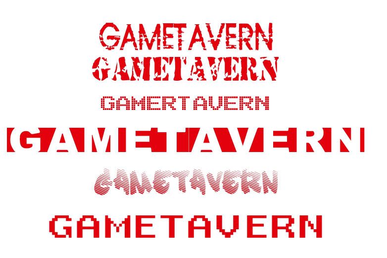
Here are some fonts I think would work nice:

oops on that one that says gamertavern
Kinda like the 2nd one...but as said hard to read with the two words together.